


Overview:
ACG was asked to create a brand identity for the county seat of Gwinnett, the City of Lawrenceville. This project was to include visual elements including logo and a comprehensive brand standards guide. The City felt that their logo had become old and stale and not reflective of the energy and momentum of growth in the city but, also felt it was important to pay homage to their history. The City also asked that we create a brand for the economic development arm of the city that would be the widest used city brand to the public.
Lawrenceville’s primary goals included:
- Establish competitive branding positions for the City of Lawrenceville
- Establish a branding initiative that supports efforts to attract new businesses to Lawrenceville
- Retain and support the growth of existing businesses
- Support the formation and growth of small businesses
- Create a brand message that highlights the outstanding available workforce, superior quality of life, ready access to educational institutions and medical facilities, easy access to the interstate, etc. in Lawrenceville
- Develop a unified message about what and who Lawrenceville is
- Cultivate community pride and enthusiasm
Outcome:
The new city logo was inspired by the original logo and seal. We created a modern design by the use of fonts and colors but, carried forth the steeple of the old historic courthouse located in the middle of the square. The design is clean and simple.
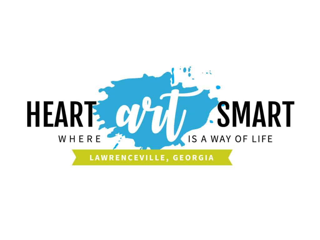
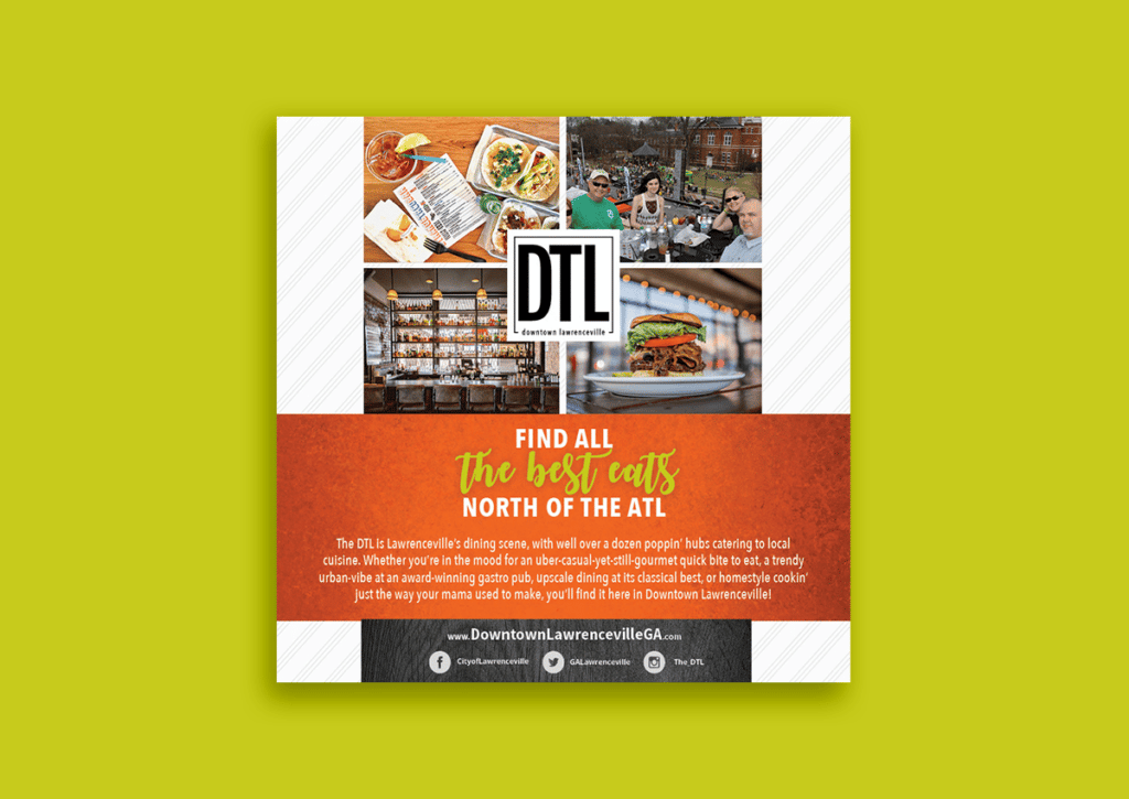
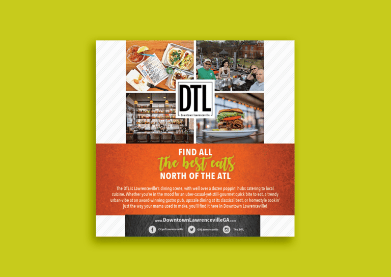
Next was to create a brand for the economic arm of the city that would reflect that Lawrenceville is home to an advanced medical center with one of the most respected cardiac centers in the Atlanta area, has an award-winning theatre within its’ vibrant art community, located at the “heart” of the county and proud to have a nationally ranked 4-year college. The new Heart-Art- Smart icon epitomizes Lawrenceville’s dedication to “Where Art is a Way of Life”, it’s tagline. The new design of the branding materials reflects all of these things. From fun, modern colors and backgrounds to contemporary fonts, the city sought to incorporate “Where Art is a Way of Life” into all of its designs and commit to the brand in its growth strategy and planning. Its been a huge success and the momentum that followed with our Excitement is BUILDING campaign carried forth in attracting and driving expansive growth in the city.